Character introduction:
This was something that was in the beginning of almost all of the mangas that I have ever read. But it was never something that I had ever paid too much attention to. Even when I transferred over to comics, I never even thought twice with the introduction missing.
It was very shocking to me when someone mentioned that the intro, was sort of like opening credits to a movie. It was a trailer that gave the audience a peek, but not spoiling the story (Maybe that was why Mimio, the actual hero/heroine in my opinion, was not mentioned), which is completely opposite of the movie trailers we have today. (Fantastic 4 movie, anyone? Yawn. More like a prolonged version of the trailer.) It gave us the idea of what kind of story we were about to enter into, the main characters, and what kind of role they would play.
Sound effects:
Overlooking the HORRIBLE translations of the Japanese, the "sound effects" that were added into the manga is very different than how it is added into American comic books.
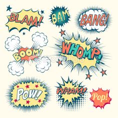

Does this look different to you? Yes the language is different, but one think that is similar is that sometimes it is incorporated with the pictures to emphasize, or to magnify the effects.
Splash Page:
Two whole pages as a splash page is actually not that uncommon in Japanese manga, especially if you look at the more recent ones. Such as Naruto, One Piece, and all of the other famous ones, you could find whole page (as in two page) splash pages more frequent than you thought. I really enjoy the splash pages. The art that goes into is not only fantastic, but the ideas that go behind are even more genius.
P64-65: drawing the characters in the negative space to convey the sense of being trapped and corner;
P98-99: the brilliant see-through wall and not-know-where-to-look brawl;
P138-139: scaling the rocket so small compared to the huge swirl of color to express the extreme circumstances that they were facing.
It is all very intriguing.
But what I want to mention the most, is the corresponding doors on page 9 and page 148. Osamu Tezuka used the doors as the signal as the beginning and the end of the journey. Very crafty. In the same way, he slips in splash pages as separations of the chapters. Just like having book dividers as the shape of books, it is full use and undetectable.
As a aspiring manga artist, there is a lot for me to learn. Not only from this book, but also the thousands of other classical and inspiring mangas waiting for me.
No comments:
Post a Comment
Note: Only a member of this blog may post a comment.